Responsive Web Design
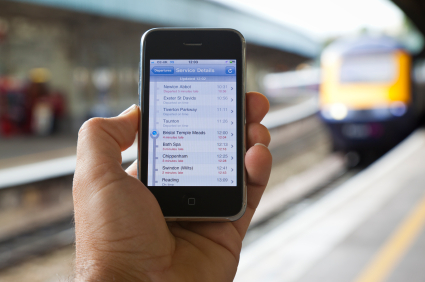
According to this Pew study, 56% of Americans have smart phones of one kind or another. If your website isn’t optimized for small screens you may be alienating half the market! There are a couple of options for making sites look good on mobile devices, but the current best practice according to Google is Responsive Web Design.
What is Responsive Web Design?
The whole concept of Responsive Web Design arose when we started looking at sites on mobile devices. Most of these devices have screens that are narrower than our desktop machines. This means that websites designed for full-width desktop screens look either too small or just plain strange on the very narrow mobile devices.
Responsive Web Design (RWD) compensates for this by using rules to re-draw the web page depending on the width of the viewer’s screen. It’s basically the same page, but its just handled differently by the browser on the device. You can tell if a website is responsive by simply re-sizing the screen width. If the appearance changes when you reduce the width, you’re looking at a responsive website.
Advantages of RWD
Have you ever visited a website on your phone and it just didn’t look right? Maybe it was all small, or some items were laid out off the side of the page. It’s pretty frustrating and often can be a huge turn-off for your customers. A responsive design caters to the screen size and automatically re-draws so everything is in view.
Using good RWD practices it’s even possible to make buttons larger for touch-screen devices so they’re easier to push with your fingers, compared to your mouse.
Responsive vs. Adaptive web design
Another option to make websites compatible with mobile devices is for the serving site to actually detect which device is requesting the website and serve a different page for the device. This is known as Adaptive Web Design. The difference here is that RWD doesn’t care who loads the page, only the width of the viewing device screen, whereas Adaptive tailors the content to the device.
They’re both good options, but at RemedyOne we prefer Responsive web design. It fits with our style of keeping things simple. We don’t care which device looks at the page- we just adjust for screen sizes. It’s simpler, quicker, and is the generally recommended practice in web design.
Another potential weakness with an adaptive approach is that often mobile devices don’t identify themselves properly when they request websites. With the fast pace of technological improvements, device identification can be tough to keep up with. This is less of a problem with responsive web design because your site doesn’t need to know the ‘who’ of the device – just the ‘how wide’!
Considerations
In some cases, you might not need your site to be responsive, or an adaptive site might even be a better option for your company site. As a leading San Diego web design company, RemedyOne should be your first call for responsive web design. And once we’ve got your responsive site up and running, we can make sure it’s optimized for search, conversions and help you use your site as a business development tool to grow your company.

